
Trending
Why milk packets in India have blue, green and orange colours

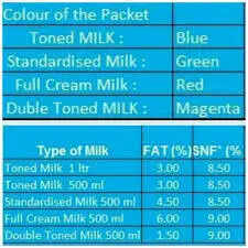
A colour code that works like shorthand
Why dairies use colours at all
The packet colour is not the same as the milk’s quality

A system that has become part of daily life
Small design, big convenience

About the AuthorTOI Lifestyle Desk
End of Article
Follow Us On Social Media
Health +
Tired of too many ads?go ad free now
Food videos
Featured In Food

Tired of too many ads?go ad free now


MORE FROM ETIMES
life & style
Hot on the Web
Splitsvilla X6 WinnerMatt BergerShadaab KhanC S LewisCelina JaitlyRanveer SinghSharib HashmiJim CarreyNasreen HashmiRanbir KapoorAakhri Sawal Movie ReviewStudy Tips For StudentAlia BhattUnique Fruit TreesThe Summer I Turned Pretty MovieChinese ProverbJames McAvoy QuoteBaby NamesChef Vikas KhannaKaruppu Movie ReviewIndian Foods‘The Summer I Turned Pretty MovieBhooth Bangla Box Office CollectionPuma VS JaguarRatan Tata QuoteRishab ShettyEurope Summer FlightDhurandhar 2 Box Office CollectionRaja Shivaji Box Office CollectionHoroscope TodayHighest Mountains in The WorldFatah 3 VS BrahmosSnakes SlitherCleanest Lakes In The USBill GatesAttracts Snakes To ToiletMartian RockJP MorganLegal Document PropertyClaim Fixed Deposit After DeathGhost Of The WoodsCaptions For Instagram Posts
Trending Topics
Latest MoviesBollywood MoviesHollywood MoviesTamil Movies 2026Telugu Movies 2026Malayalam Movies 2026Kannada MoviesMarathi MoviesBengali Movies 2026Top Rated Movies 2026Best Hindi MoviesBest English MoviesBest Telugu MoviesBest Tamil MoviesBest Malayalam MoviesBest Kannada MoviesBest Bengali MoviesUpcoming Hindi MoviesBest Movies Of All TimeBest Hindi Movies of All TimeLatest English MoviesLatest Malayalam MoviesEnglish TV NewsTamil TV NewsTelugu TV NewsMalayalam TV NewsKannada TV NewsMovie ReviewsBhojpuri Cinema NewsGujarati Cinema News
Popular Categories
Viral NewsK Pop NewsWeb Series NewsAnime NewsUpcoming English MoviesUpcoming Tamil MoviesUpcoming Telugu MoviesUpcoming Malayalam MoviesUpcoming Kannada MoviesFashion TipsTravel NewsEntertainment NewsBollywood NewsTollywood NewsKollywood NewsMollywood NewsFood NewsLatest Hindi MoviesLatest Tamil MoviesParenting TipsHome RemediesWeight LossBeauty TipsParenting TipsHindi VideosHindi Video SongsBhojpuri Music VideosLatest Telugu MoviesBhojpuri Music VideoHindi TV News
Latest News
Hazaribag man drowns while fishing in lake"Behen Darr Gayi!": Fans relive ‘Bhagam Bhag’ era after watching Akshay Kumar's 'Bhooth Bangla' trailerMBOSE HSLC result 2026 to release tomorrow: Check details hereIran war risk: JPMorgan CEO Jamie Dimon warns of oil shocks, sticky inflation and higher interest ratesMake your clutch last longer with these easy driving tips“Three-against-one situation”: El Rubius opens up on being “targeted” in MrBeast’s viral $1M challengeBihar BTSC lab assistant notification released for 1091 posts at btsc.bihar.gov.in; apply hereIPL craze costs techie Rs 1.46 lakh in fake RCB vs CSK ticket scamRaising “robot-proof” kids: Why creativity and curiosity matter more than everInside ‘Satguru Sharan’: Exploring Saif Ali Khan and Kareena Kapoor Khan’s Rs 100 crore Bandra homeHow selling Alaska in 1867 was a costly mistake for Russia'Hera Pheri 3 is coming': Paresh Rawal dismisses delay reports and reveals he will 'start shooting soon'US-Iran War: A daring rescue Hollywood blockbuster is on its way. Till then, pick your favourite from these 10 films on bringing someone home against all oddsKolkata team unveils fan mural at Rash Behari Avenue, celebrating city’s first loveHow US spread a lie to rescue a pilot of a jet shot down in IranNetflix unveils ‘VOID’, an AI model that can change a movie plotAI data centers are causing 'stress' not just to tech companies, but also private insurers"Trans women are.....": Clavicular’s viral moment with trans women sparks fresh conversation on internet culture